Project Vision
‘Mimic’ is a music discovery service that primarily allows for users to share their music taste with the press of a button. With current music applications, the data visualization and sharing of music taste aspects are either non-existent, very limited, or extremely outdated. Mimic aims to fix that by bridging the gap between potential playlist favorites and music enthusiasts themselves.
Challenges
- Create easy-to-understand data visuals for listeners.
- Explore artist’s tracks and albums seamlessly.
- Allow users to dive into the music they’ve listened to.
- Bridge the gap between users sharing their music taste.
Kickoff
Starting off, I asked myself a few initial questions. Who is our primary user? What kind of goals do they have? Why would someone want to use this application? Just how large of a scope do I want this project to be? After interviewing four participants to establish archetypes later on, it became evident that the goals they wanted to accomplish all fell within the same categories; finding out more about their listening habits & identifying more of the music they like.


Competitive Analysis
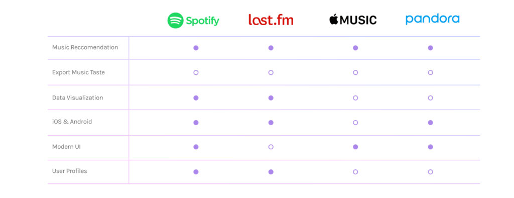
In order to construct a concise and solid foundation for Mimic, I had to venture out and see what the prominent music applications were already doing and what user goals they were not reaching. I evaluated several features deemed vital from user surveys and identified which ones Mimic could capitalize on to have a leg up over other applications.
I found that only two of the four main competitors offered user profiles and data visualization for users. Even then, Spotify’s user profile feature is incredibly limited and their data visualization is only available at certain points throughout the year.
Last.fm houses both user profiles and data visualization for users, but fails to communicate to users how their data should be interpreted.
Evaluating the Activity
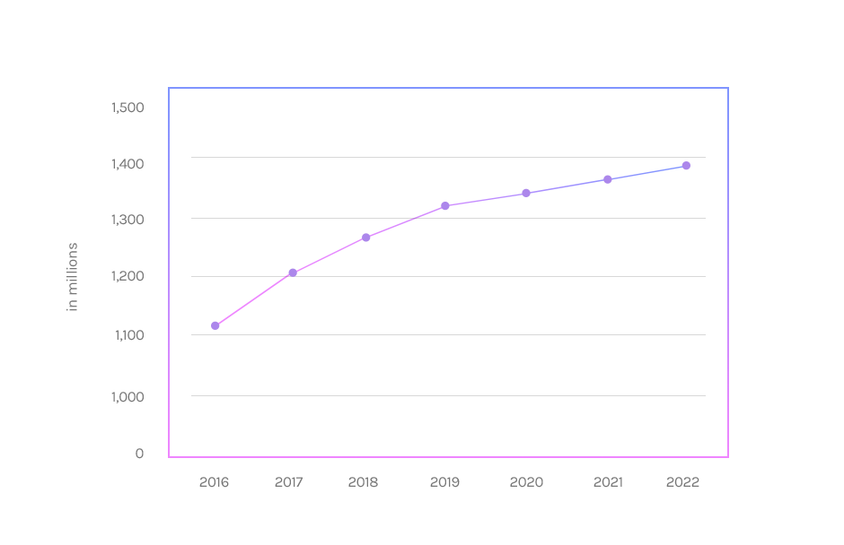
Just how popular is music streaming in general? According to Statista (June 2018), across all platforms including Spotify, Apple Music, Pandora and more, close to 1.2 billion users streamed in 2017 alone. Streaming services are projected to be used by close to 1.4 billion users in 2022.
With this in mind, it became clear that people’s passion for listening to music isn’t going anywhere, anytime soon.
Prioritization Plotting
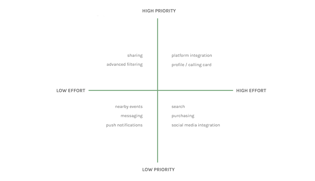
Plotting a list of the possible features onto a graph helped narrow down what was absolutely crucial for delivering the mvp and would could be built upon further down the road. A big draw of using this application is to be able to share with others how you listen to music, and who you listen to regularly. We can help users reach this goal by creating what is essentially a business card for each user, but for music instead.
Personas

Name: Vicky
Age: 28
Occupation: Engineer
Vicky is systems engineer at a marketing automation business, but is a music enthusiast at heart. He loves to share what kind of music he listens to with his friends, but has a hard time finding an application that lets him easily do that.

Name: Sonia
Age: 23
Occupation: Student
Sonia is a commuter student who attends a university roughly an hour away. She dreads the morning traffic, but looks forward to listening to new music each and every morning. Spotify’s Discover Weekly just isn’t cutting it for 5 days a week, so she’s looking for something new.
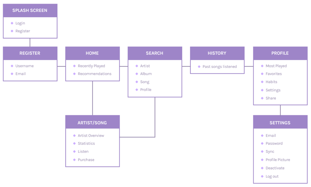
Information Architecture
Wireframes
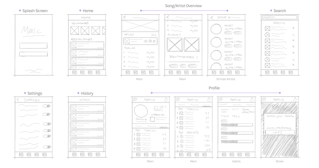
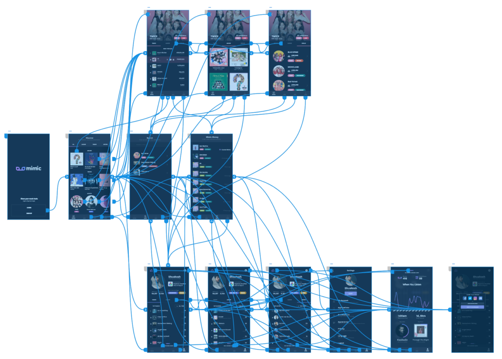
Before moving onto high fidelity wireframes and mocks, I wanted to get a feel for what the core of the app would look like when put in front of me.
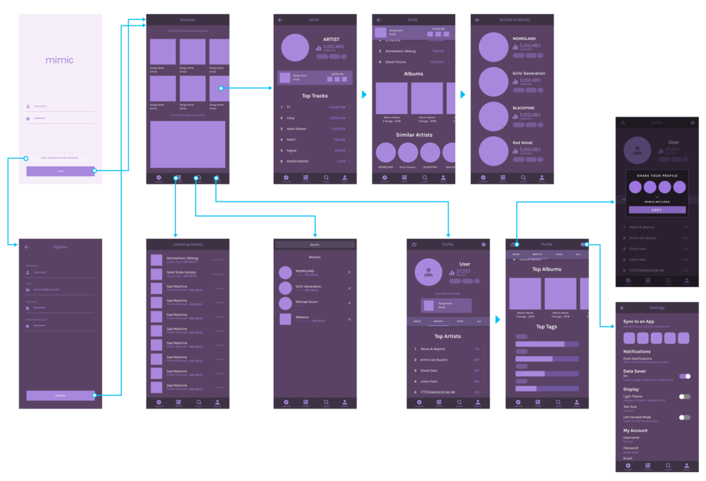
Wireflows
Design Challenges
Comprehending the Data
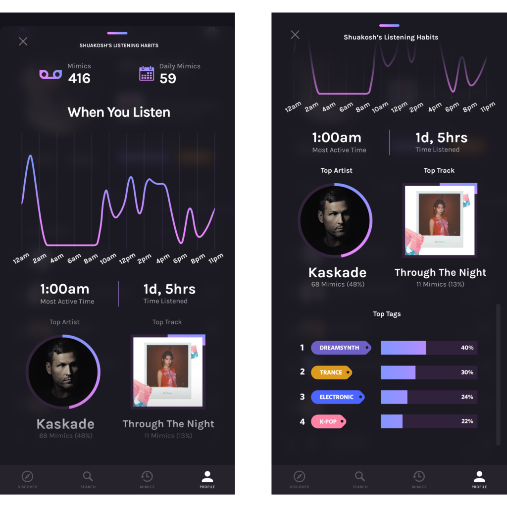
Creating easy-to-understand data visuals for listeners was a goal that helped drive this project as far as it did. A lot of the time, users don’t know how to read or comprehend the data that apps throw at them. I solved this issue by using charts and graphs to help the user understand on a more familiar level.
Seamless Exploration
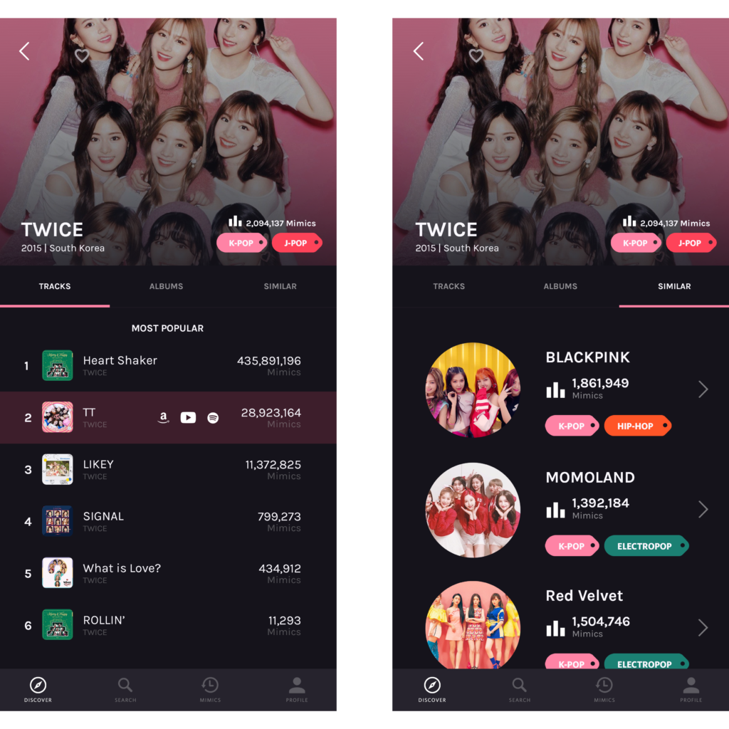
Before establishing a familiar navigation throughout the app, I had to decide what kind of navigation would work best for the user. I decided to test a sub navigation similar to the ones in apps like Twitter and Reddit. Placing the navigation between the cover and the main content of the screen allowed me to create a natural bridge between contents of the screen.
Listening History
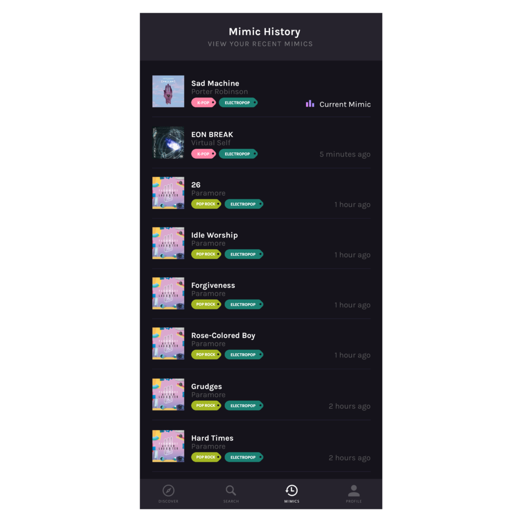
I wanted to allow users to explore their music listening history. It’s cool for users to go back and see what tracks they’ve listened to, what genre, and how long ago it was. It helps you get a better feel for what kind of music kick you’ve been in lately at a glance without having to go into your profile.
“What kind of music do you like?”
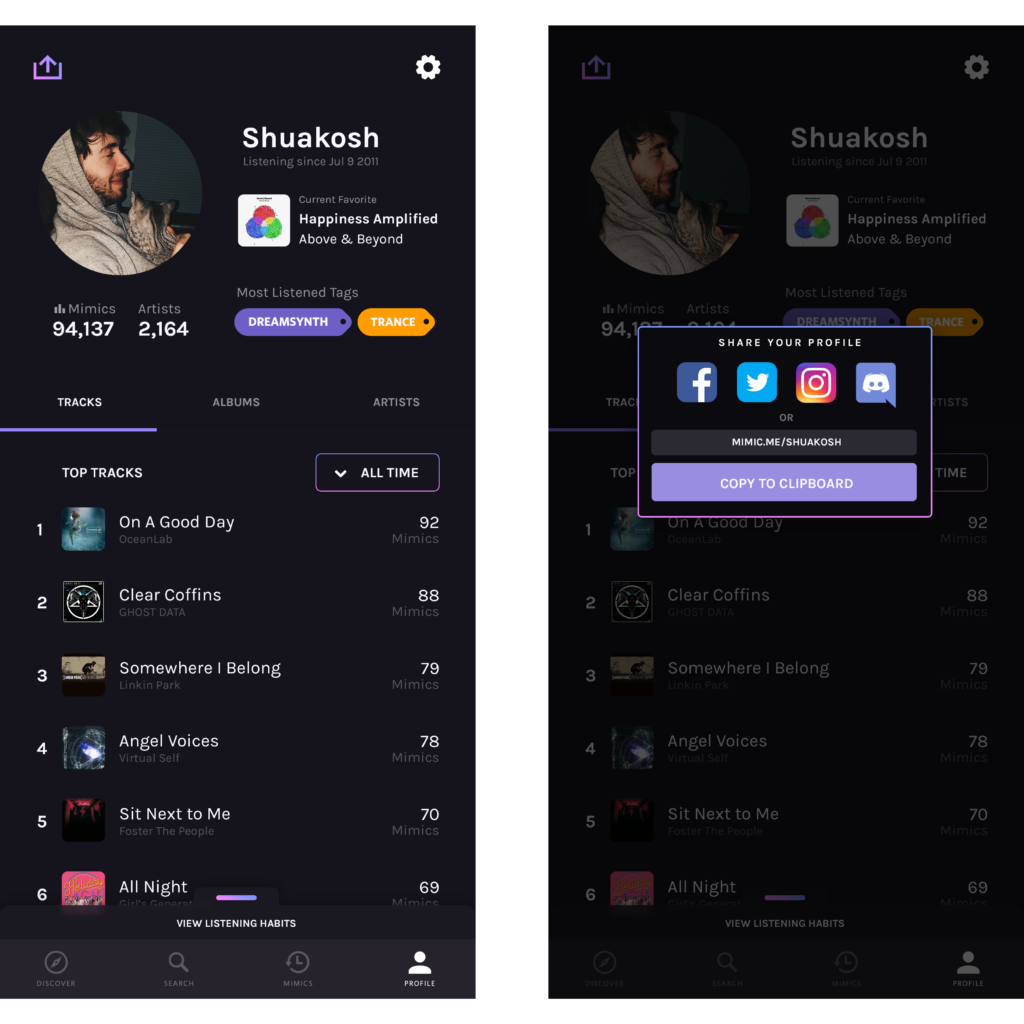
Ahh, the age old question… “What music do you like?” or “What kind of music do you listen to?” Answering this question is no longer an issue as users are able to easily export their profile with one tap, allowing you to share with others exactly the kind of music you enjoy.
Style Guide
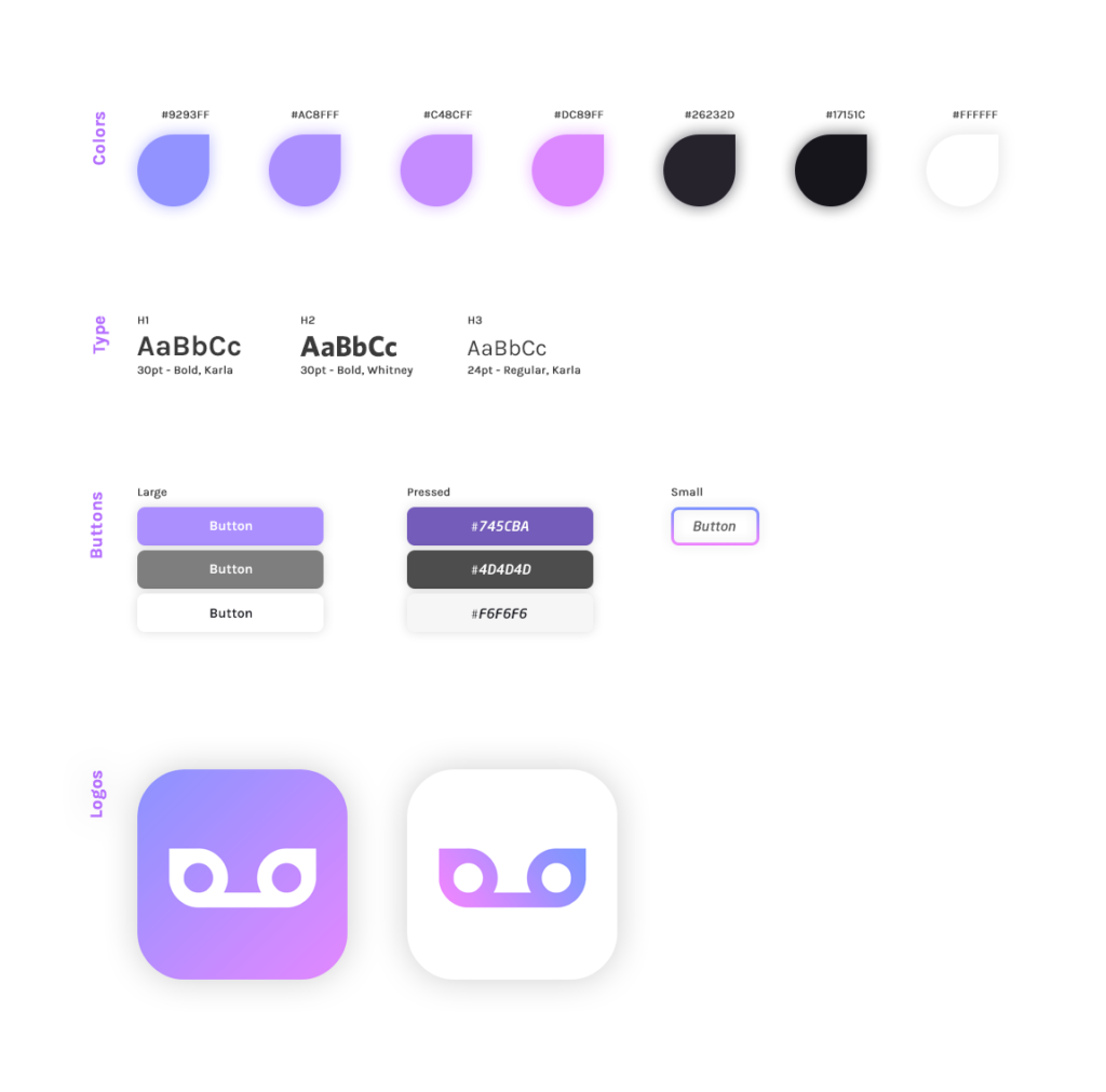
Utilizing a soft gradient consisting of cool and calm colors felt like the perfect fit for Mimic’s branding. The blue helps evoke a happy feeling out of users , and paired with the fuchsia it creates a nice balance between calm and energetic. The main typeface of choice for the app is Karla. I felt this typeface best fit the app do to it’s extreme versatility through uppercase and lowercase styling, as well as dark and light text fills.
The prototype
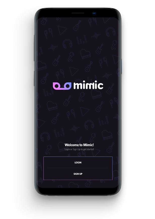
Splash Screen
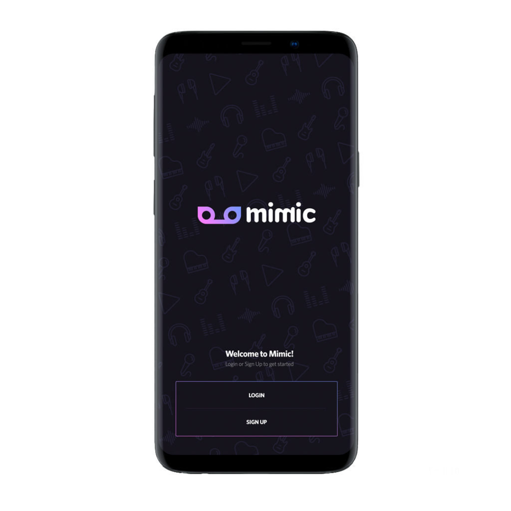
Classic splash screen with login and sign up option.
Home Screen
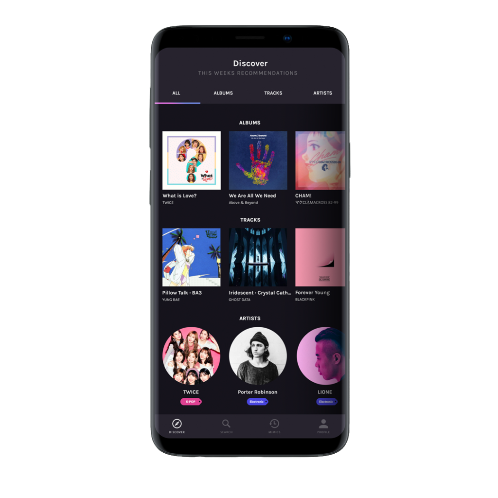
Following the splash screen, the home screen shows the user music based off their current music choices.
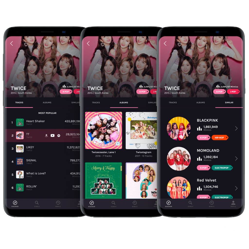
Artist
Provides the user with statistics of how popular a track or album is, along with suggestions for similar artists.
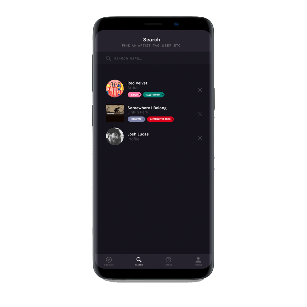
Search
Search feature is essential. It lets you search any track, artist or album.
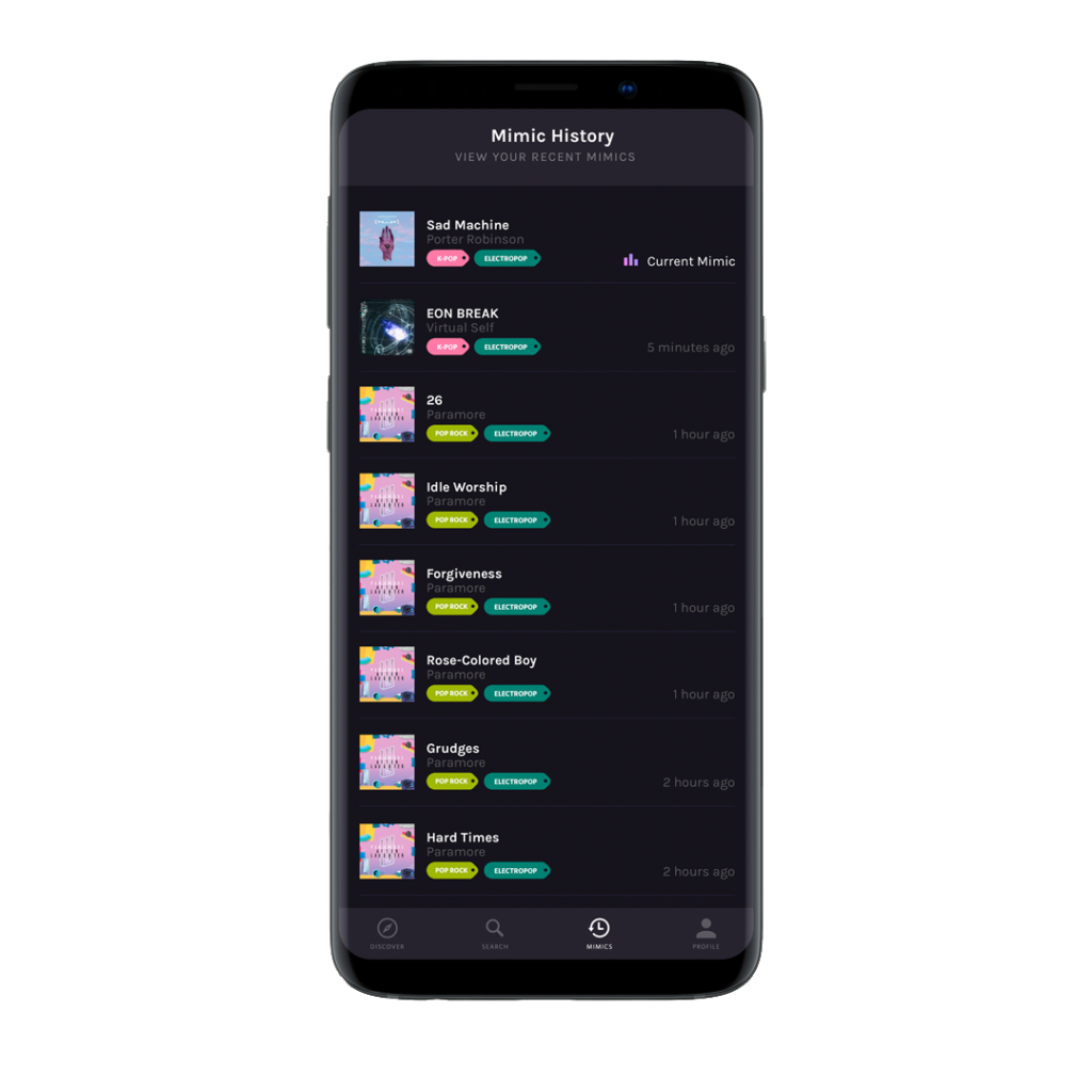
Listening History
Allows users to revisit and navigate their listening history.
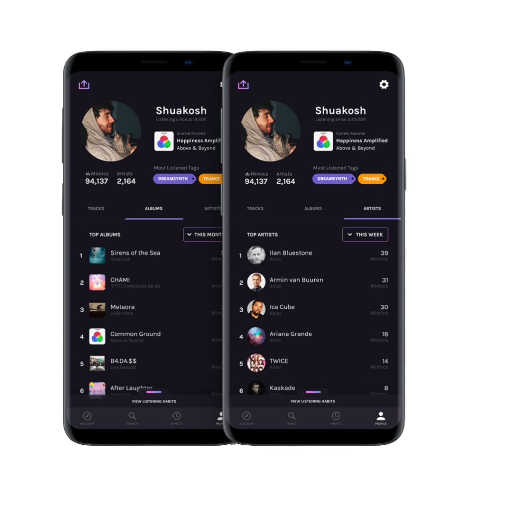
User Profile
User profile lets the user save tracks they like, view their most listened to music along with the option to set a favourite track.
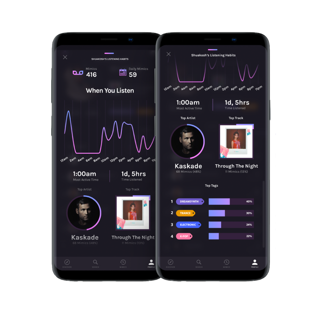
Listening Habits
Lets the user view statistics of their listening habits.
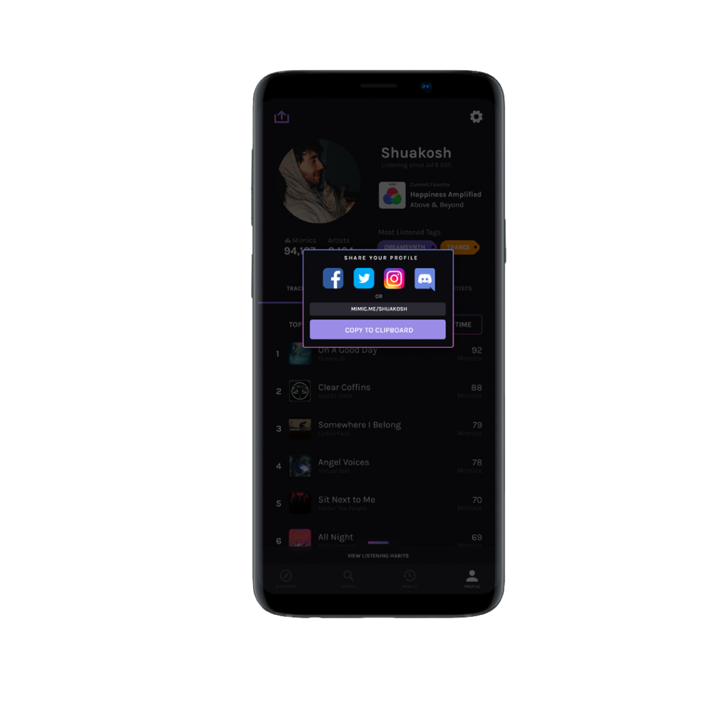
Share
Lets the user share music on various platforms. Also allows users to share their profile.
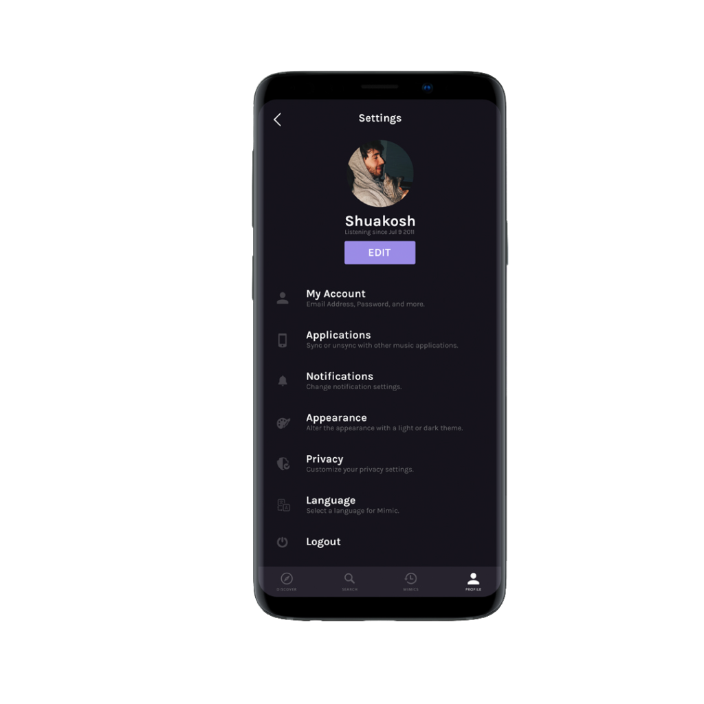
Settings
Lets the user alter profile, appearance etc settings as per their choice.
Conclusion
Key Features
- Real Time Mimics – View music recently listened to from other application.
- Data Visualization – Visualizing listening habits.
- Sharing – Sharing music made easy.
- Discovery – Efficient music discovery system.
What I learned
I got to experiment with some of the new Adobe XD features, and narrow down my design process. Although I was not able to fully flesh out other features and designs I wanted to within Mimic due to time constraints, it’s not to say I won’t try to incorporate them in future projects down the line.

