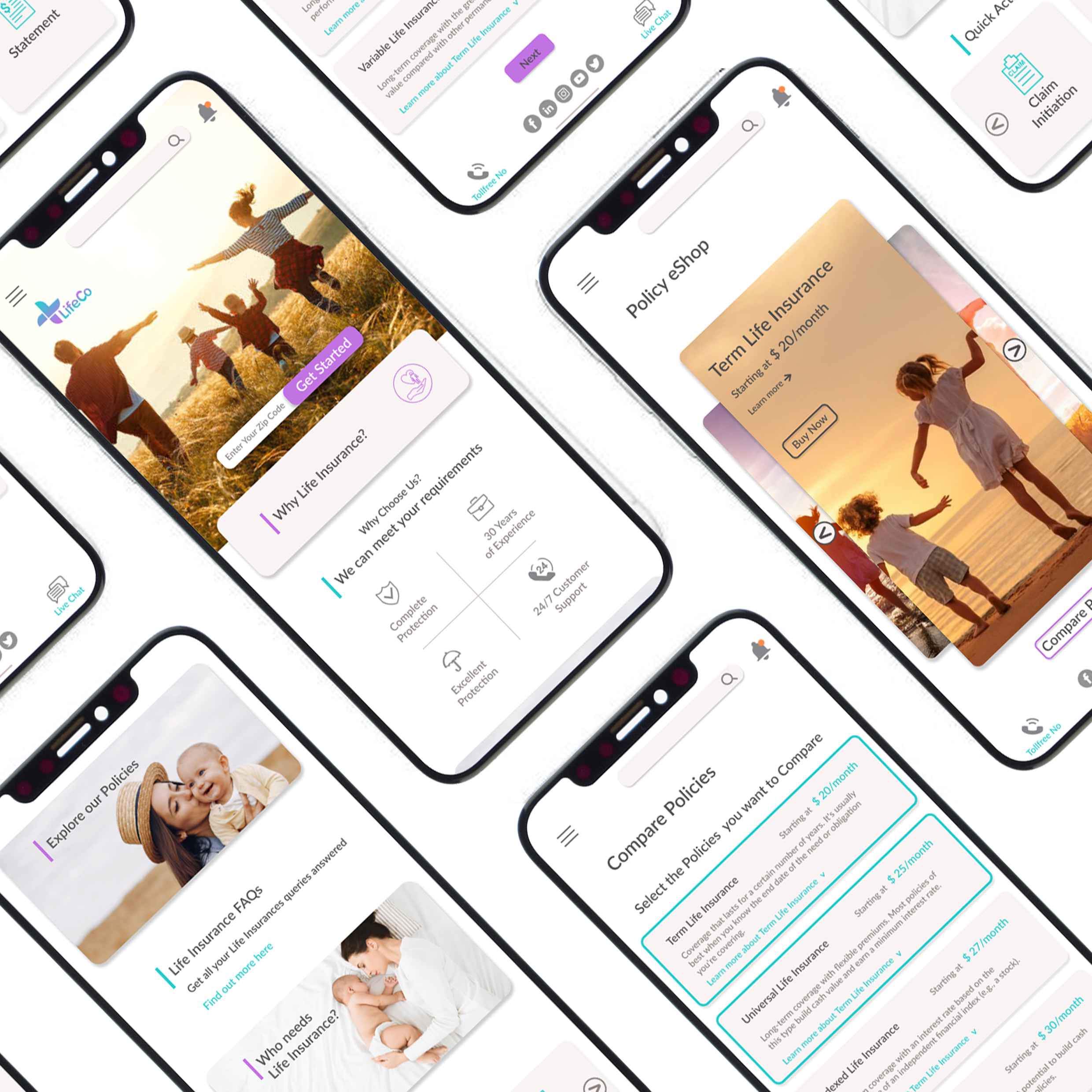
The following case study is part of a design challenge. I am not in any way affiliated to LifeCo or any other companies/individuals mentioned in this article. The design decisions and assumptions taken in this case study are solely based on the design brief.
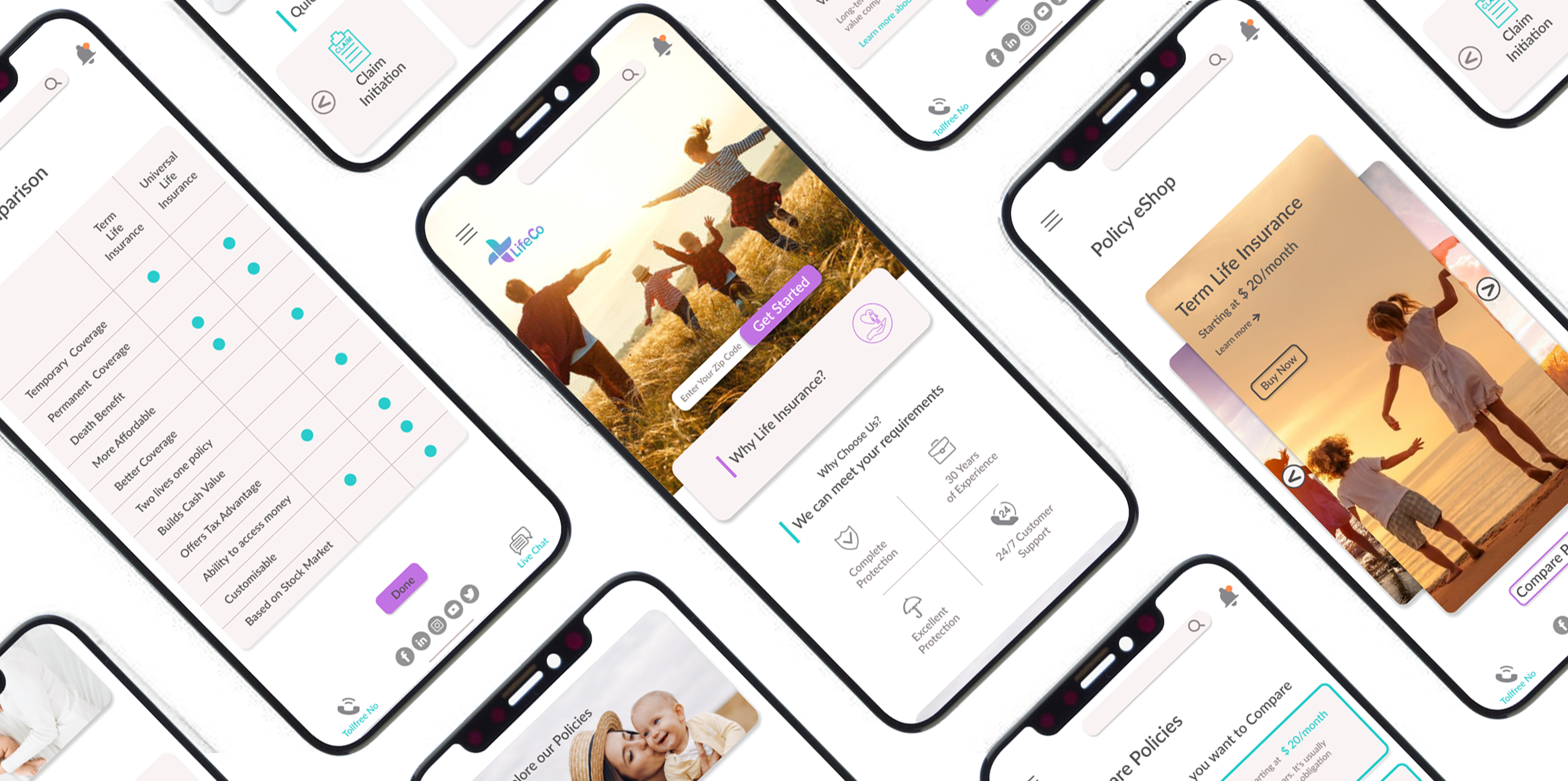
The Design Challenge
‘‘LifeCo are a traditional Life Insurance Company based in the USA who are in the process of digitising their business. Currently, users need to complete paper-based application forms to purchase LifeCo’s products.
During a recent all hands company meeting, LifeCo’s Product Head unveiled a radical new product strategy stating that LifeCo’s focus for this year is to target digital-first consumers by selling their life insurance products exclusively online.’’
Key Deliverables
- To educate Life Co’s clients on it’s products
- To help clients in estimating insurance cost
Understanding the Task
LifeCo are an insurance company which has been selling policies to clients via paper-based application forms. Recently, the company has decided to sell their product online.
In order to do that, the company needs a responsive e-commerce website and an app, which are user friendly and clean. Also which is capable of filtering product based on basic values and able to return relevant data such that their users can easily figure out what services are offered.
As per existing research the main problems being faced by their customers are
- Trouble understanding LifeCo’s insurance products
- Trouble estimating LifeCo’s insurance costs
The Objective
To create a new digital experience solution that gives prospective clients the confidence to start a life insurance application on their own.
Defining the User
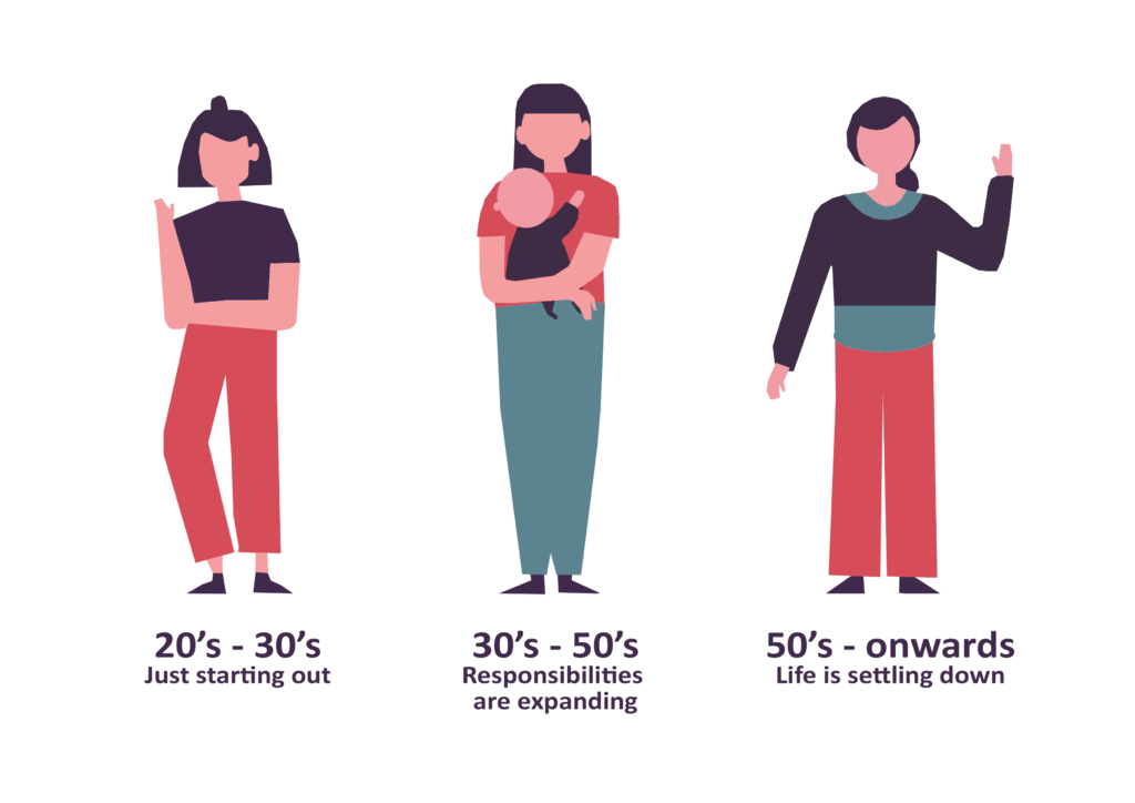
Before jumping into the research phase, I stepped back and listed all the potential users of this insurance platform. I realized, there is a diverse set of users from ages 18–78 and they will use the system at different touch points with different priorities.
The Digital Nomads : A highly digitally active group, ready for a new model of delivery.
The Hunters : Searching for the best deal. Price comparison is important.
The Quality Seekers : Loyal to insurers that deliver on brand integrity and service excellence
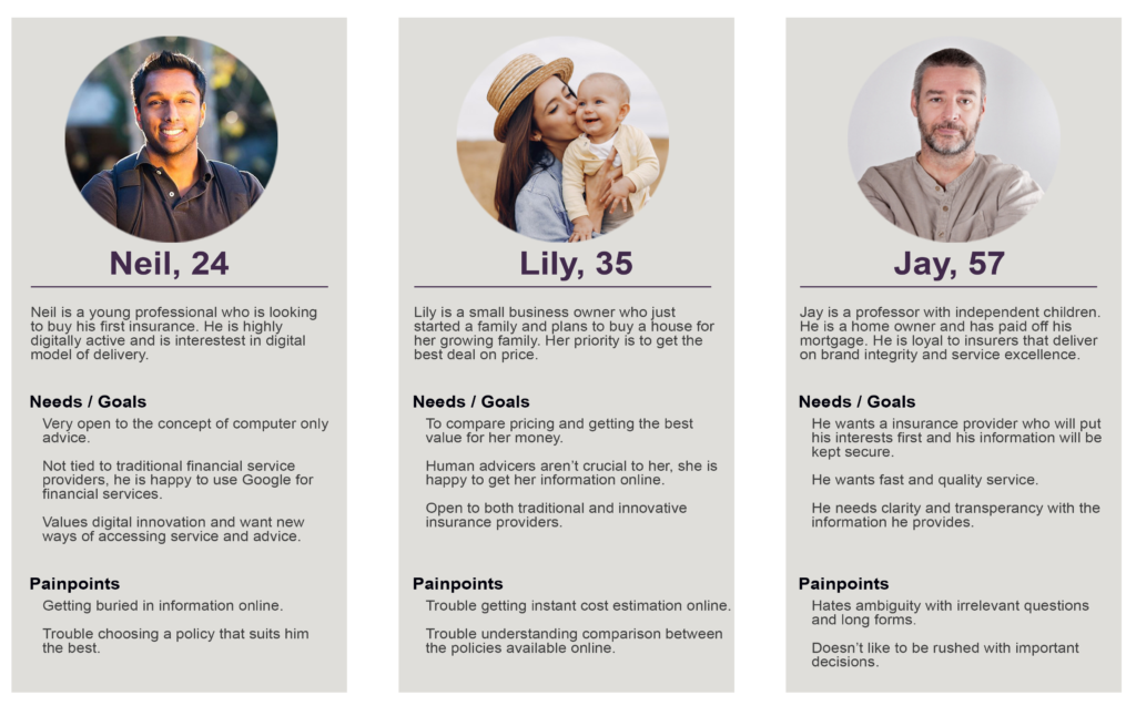
Personas
I created three personas based on my understanding of the end user. I included demographic and goals to helped me envision the kind of problems the users might have.
Life Insurance Ecosystem

- Insurance Providers, work to provide best services to customers. Therefore in order to serve the customers with highest satisfaction and quality, insurance providers assists them with tools and services that enables them to experience the product with great customer experience.
- Agents & Customer Support Operatives, are improving the business by creating a business relationship that is built on trust and effective solutions.
- Customers, who are the end users of the insurance ecosystem and insurance providers device tools and services in order to make their experience as friction less as possible.
Understanding user context and user need
The problems you think users may have are not always what they truly face. Most of the time what we think will be the problem, will be different from real problem. After finding some potential pain points, I went on to conduct user interviews to get a deeper understanding of their needs and validate my assumptions.
User Survey
I sent out a questionnaire survey with a link to Google Form and got 24 responses.
1. Do you buy and renew life insurance policies online?
2. Do you find insurance terms challenging to understand?
3. How do you research about which insurance policy to buy?
4. What’s the most important factor while buying insurance online?
5. What is the biggest hurdle while buying insurance online?
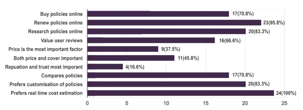
The survey helped me validate some of my assumptions and gave me some ideas on the features I needed to add to improve the experience.
User Interviews
I conducted 3 phone interviews with customers who have used an insurance portal or bought policies online in the last 5 months to help me see how much they agreed on the pain points raised from the survey, thus giving me an idea of the intensity of each problem.
One customer relies on other customers’ reviews heavily when choosing an insurance provider.
“Because of the vast number of positive reviews, I decided to go with X insurance company.”
All three agreed insurance terms are always challenging to understand.
“There’s just so much stuff on the website. That’s why I like the concept of being able to consult with somebody in a personal way so that somebody can help guide me a little bit to narrow my choices. That’s very reassuring to me.”
A first time buyer found choosing the correct policy to be extremely confusing without any guidance.
“Oh it is totally challenging! I had to call up my dad, couldn’t have done it on my own.”
Empathy Mapping
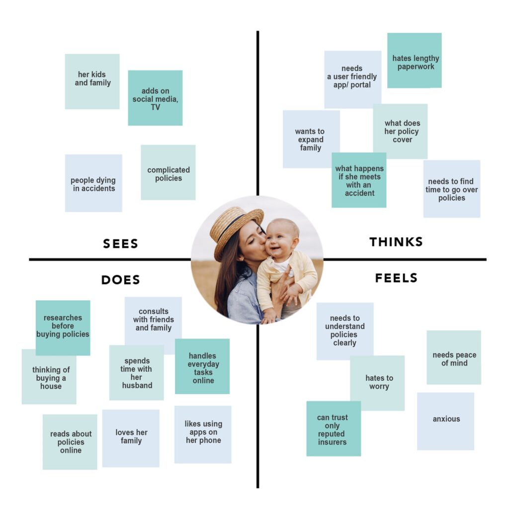
After conducting the user research, I used an empathy map to gain a deeper understanding of each user’s distinct experience with life insurance. The empathy map consisted of 6 quadrants – see, do, think, hear and persona’s pain and gain. I chose Lily’s persona for the empathy map.

Key Insights from Research
The User research generated a few key insights, which became the basis of user needs:
- People are willing to spend time in understanding policy terms. Insurance is important and important decisions take time.
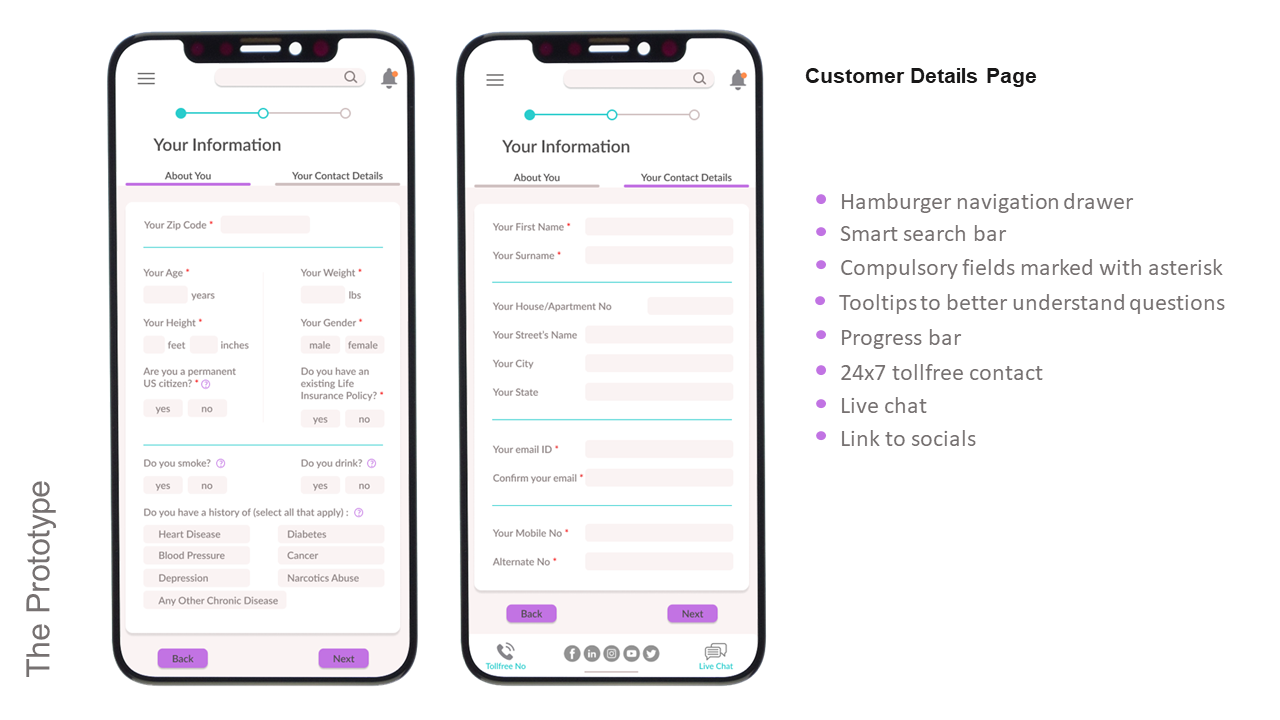
- Transparency is the key. Lack of clarity on the questions asked on the form makes customers feel reluctant or insecure.
- Ambiguity reduces trust. Cost estimation questionnaire shouldn’t include irrelevant questions.
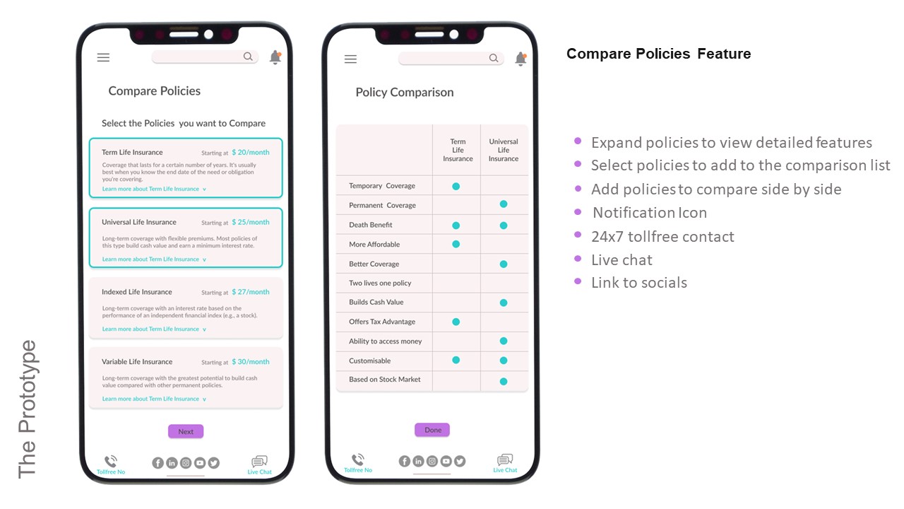
- Users want detailed comparison, with differences in policy terms highlighted.
- Users typically start their search online but it’s always after dialogue with an agent, whether over the phone or in person, that they make the decision to buy.
- Regardless of education level or time spent on research, insurance terms are always challenging to understand.
Competitive Analysis
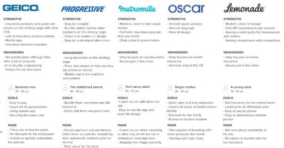
I reviewing a few Insurance Websites and Apps to have a better understanding of their strengths and weaknesses to help me determine the key features while designing the interface. The most important features are:
- How the products are showcased (user friendliness)
- Whether they have a mobile app
- Ease of access while navigating
- A modern, clean UI
- Search options
User Journey

Identifying Pain Points
I highlighted all the problems that the customers mentioned from the interviews as well as the survey, and did a card sorting exercise to determine categories of the pain points.
- Trouble understanding LifeCo’s insurance products.
- Trouble estimating LifeCo’s insurance costs.
- Getting lost in information.
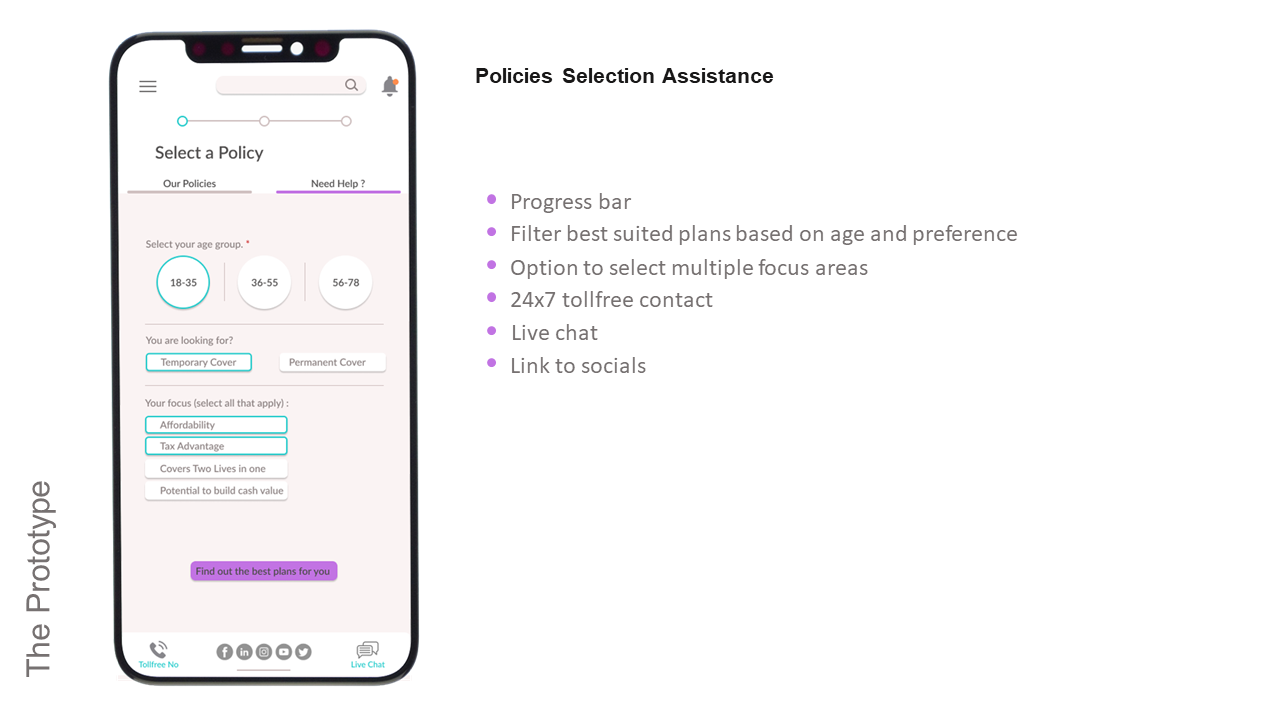
- Unable to identify best plan for self.
- Forms too complicated.
- Unable to understand certain questions on the form.
- Needs to compare the products to better understand similarities and differences.
Define
User Story
Keeping the end user in mind, I created a user story to define the problem.

When I buy life insurance policy online, I want to have clarity about my policy and have instant cost estimation so that I can have peace of mind.
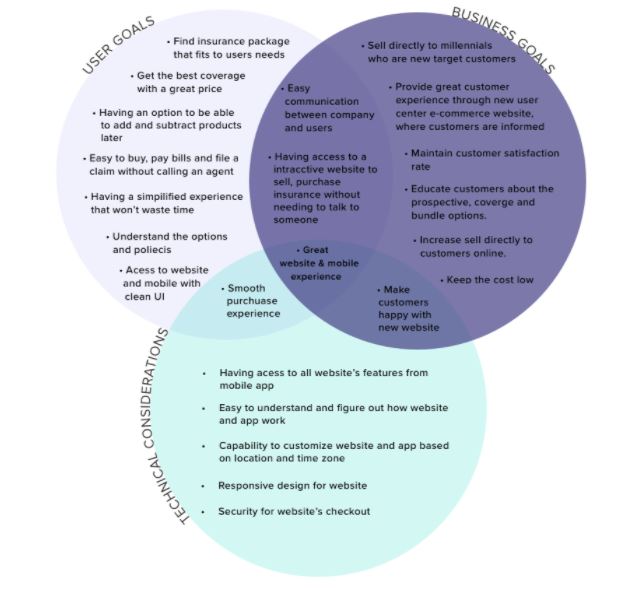
Desired Outcomes / Project Goals
Storyboard
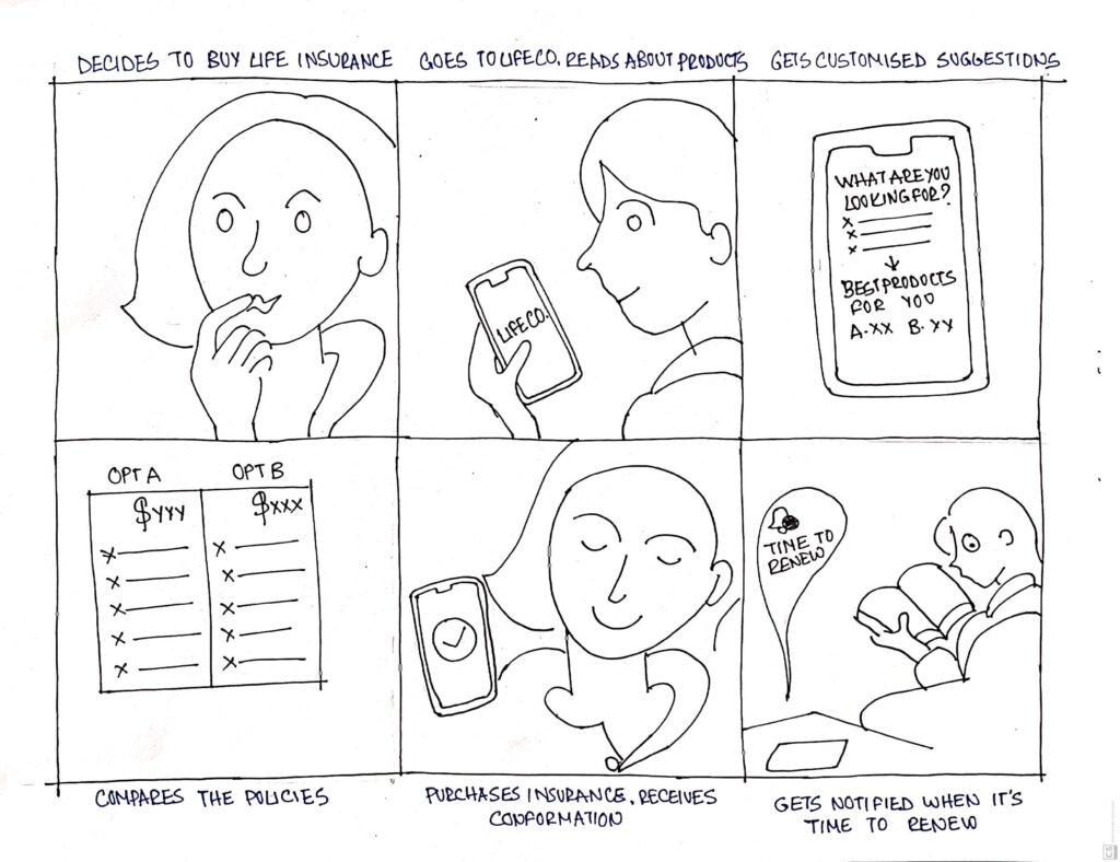
Project Feature list
- Responsive digital experience: access across all devices
- Profile login: access profile to make changes to coverage, change personal information etc.
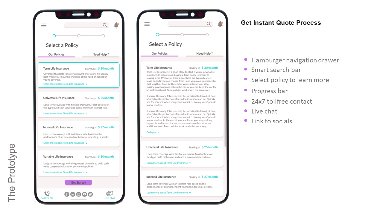
- Product information: access to understandable information on products.
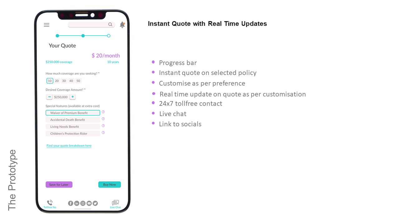
- Chat option: access to live chat 24×7.
- User’s portal: access to all policies, edocs and personal information from any device.
- Online payment: access to pay bills easily online.
- Secure checkout: secure checkout to prevent fraud.
- FAQ page: answers to frequently asked questions on insurance.
- Customize policy: access to customise policies.
- Instant quote: access to instant quote on policies.
- Smart search bar: access to search option to search across the website/app.
- Policy Comparison: access to detailed price and policy comparison.
- Personal recommendations: access to filter best policy for self.
- Notification: app notifications.
- Wishlist: save selected properties
- Tooltips: tooltips for information.
- Expandable detail tab: access to detailed description only when selected.
- Articles: access to useful articles.
The Solution
Sketches
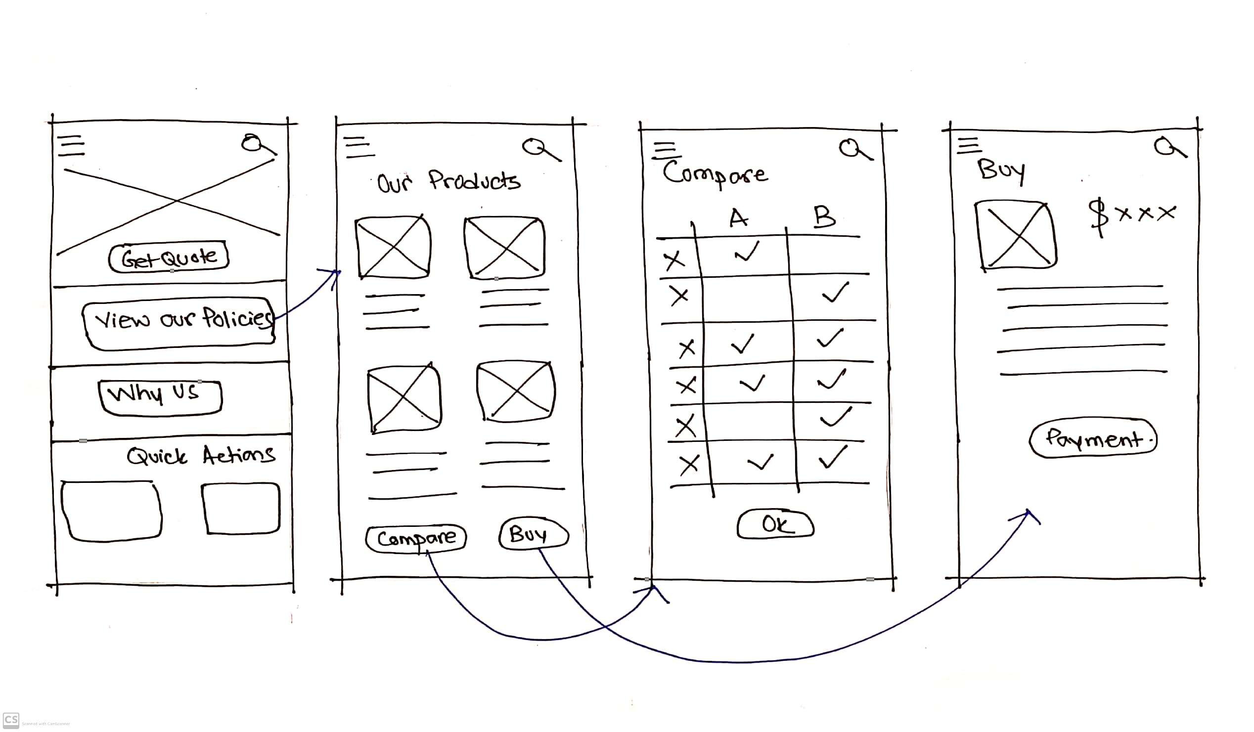
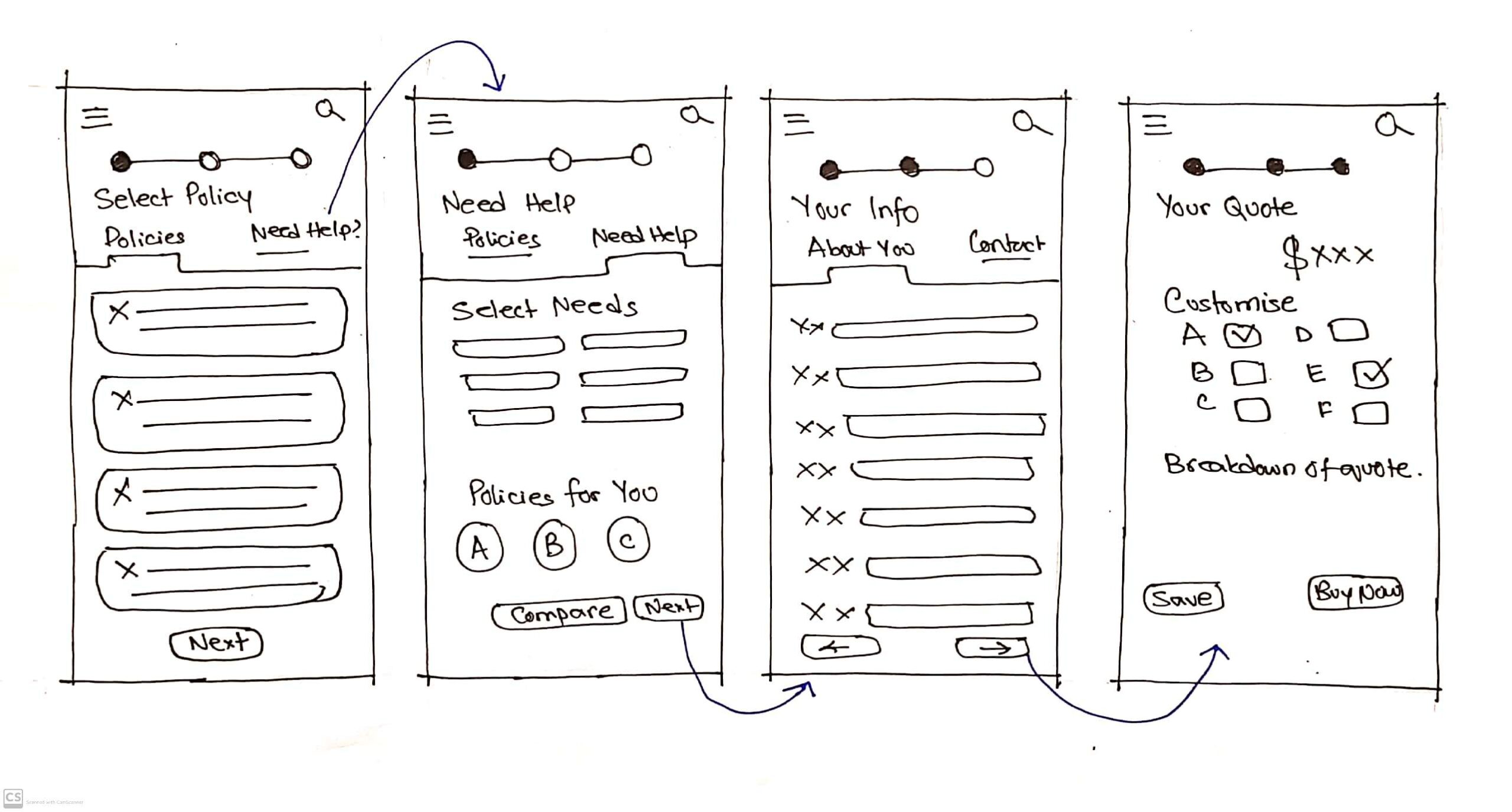
Information Architecture
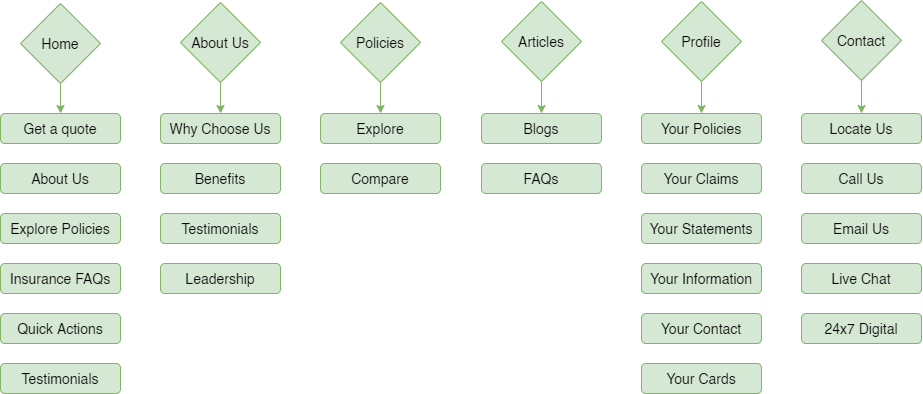
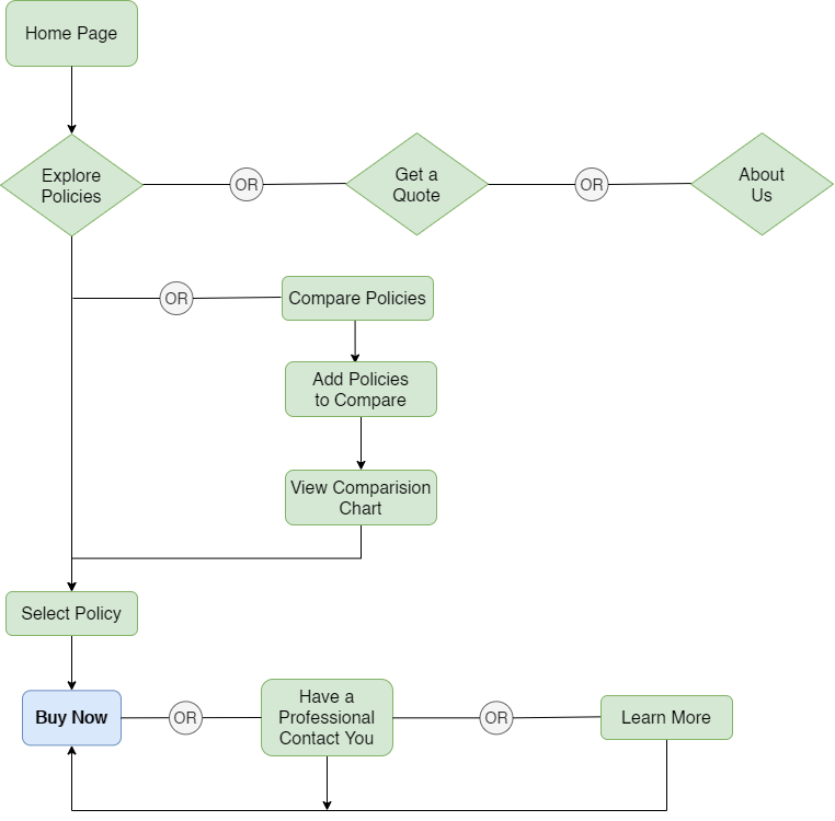
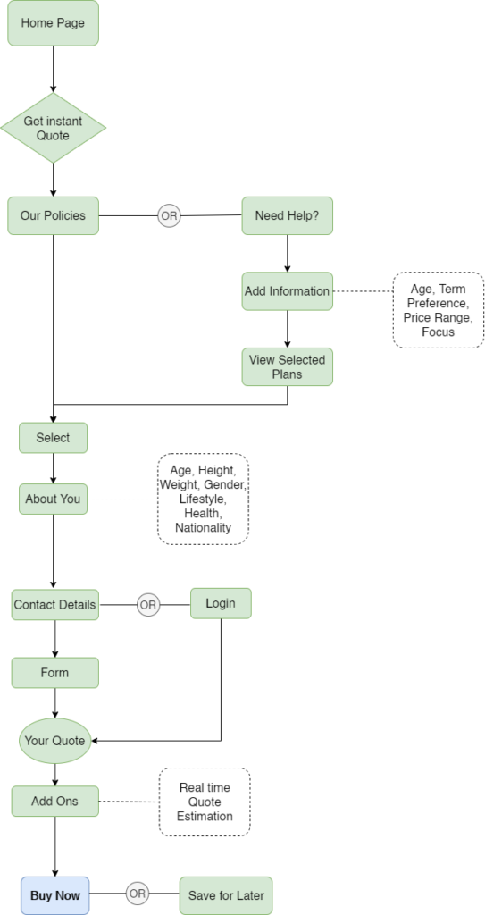
User Flow
1. Educating Clients on the Products
2. Policy Cost Estimation / Quote
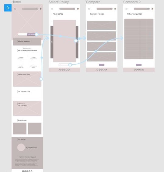
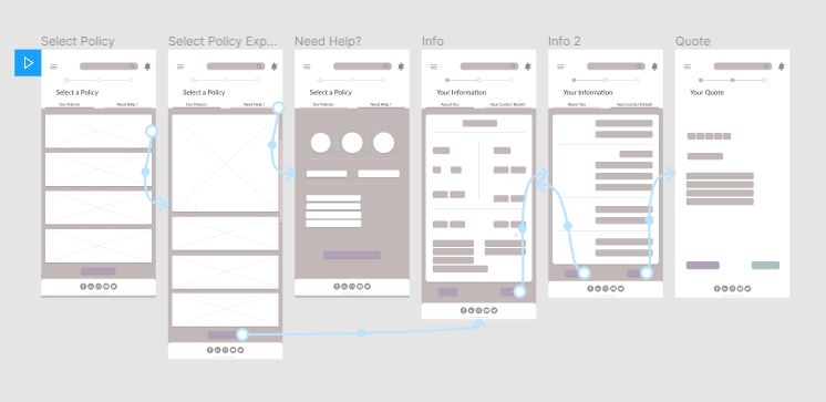
Wireframes
Explore Policies Wireframe
Cost Estimation Wireframe
Usability Testing
I put the wireframes to test to see if users are able to execute the given task smoothly with the navigations. I also observed how well can they navigate and if there is any confusion or difficulties faced.
Through the test, I learnt that the navigation panel is straightforward and the flow is smooth for visitors.
Visual Design
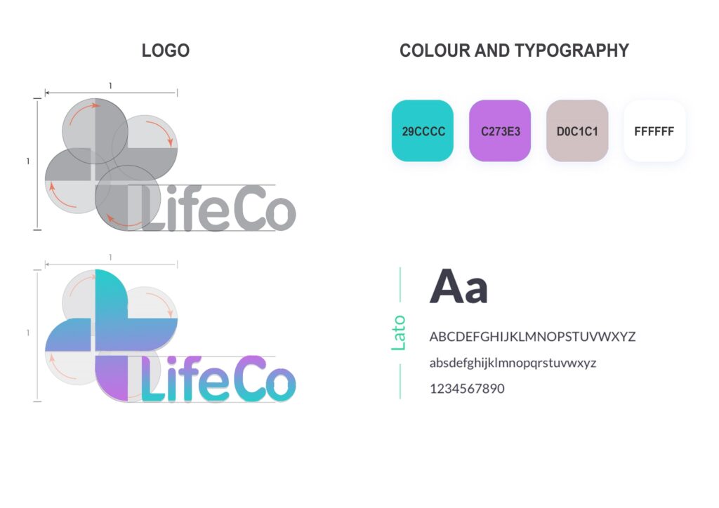
The Plus symbolizes medicine and health. I drew my inspiration from it to design the logo for LifeCo. The shape is derived from intersecting circles, representing the circle of life. I then sectioned the plus to highlight the L of LifeCo.
Prototype
Conclusion
Testing the Prototype
Tested the working prototype with 5 people and found favorable results.
They loved the simple interface and gave 9/10 NPS and said the solution will immensely help them and addresses all the issues they are facing at the moment.
Future Implementations
In the future, additional features can be integrated
- facial recognition
- chat bot
- virtual video connect with agents
Takeaways
- I had a great time working on this design exercise. I am certain that I have just touched the surface of the entire digital experience and need a lot more contextual and user analysis to identify new challenges and needs.
- Storyboarding is super-helpful to understand all the use cases.
- Users are drawn to products that are well designed and provide novel interactions.
- Forgot to showcase my core skills: micro-interactions, UI.
- Having a project plan and trying to stick to them really helps in completing the task needed for the project on time.

